Michael Craig-Martin
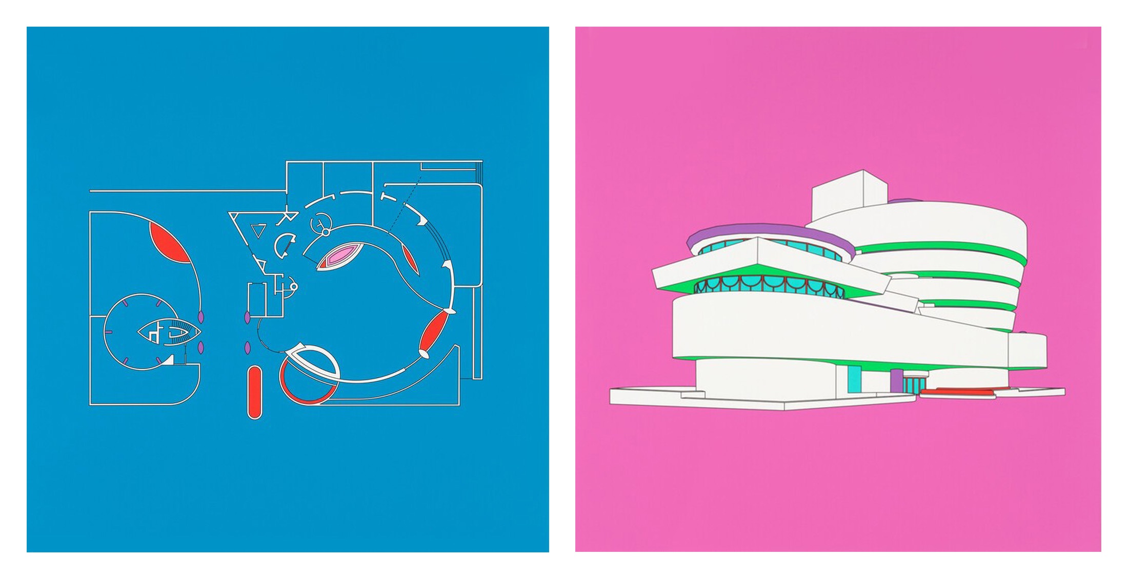
Michael Craig-Martin deviates only occasionally from his commitment to describing prosaic household objects in his drawings. Such deviations include, among others, garish restagings of art-historical paintings, studies of mid-century modern design pieces, floral arrangements, and architectural renderings of iconic 20th-century buildings. Guggenheim, from the series Plan and Elevation (2017), figures the landmark Solomon R. Guggenheim Museum seen from two views. In the first, the museum’s floor plan is reduced to colourful abstraction against a blue ground; in the second, the landmark’s white-concrete construction appears on a bright pink plane, its shadows green and detailing accented in purple, blue, and red. Frank Lloyd Wright’s technical drawings, reduced to their essential lines and made unfamiliar by the flat colours applied, are approached with the same austerity of expression Craig-Martin applies to all his subjects, each given with perfect neutrality and disregard for hierarchy, from the mundane stuff of life to symbols of cultural pre-eminence.
b.1941, Dublin
Though widely recognised for his brightly chromatic, graphic line drawings, which reduce everyday items to their Platonic ideals as schemes rather than still lifes, Michael Craig-Martin was for many decades deeply reluctant to work with colour. For the first thirty years of his practice – what he terms his “monochromatic prehistory” – he resolutely avoided saturation in his work.
I’m an almost excessively logical person… And colour seemed so wayward. It wasn’t until the early 90s that I suddenly started to use big colour – red, yellow, blue, green, pink, orange – always the brightest hue of whatever colour it was, and always a colour you could name, just like the objects. I don’t use a mixed colour, never greyish or bluish.
His drawings, colourful or otherwise, are characterised by uninflected lines devoid of gesture, originally made with electrical tape traced over drawings projected onto a given surface and later produced with digital technologies. Of his ‘styleless’ studies, he has written: “My subject matter is obvious – man-made objects, useful things. But that’s not what my work is about. It is about an exploration of the miracle of two-dimensional imagery.”
The interplay of language, image and perception has remained a primary preoccupation across his varied practice, from his Conceptual works of the 1970s, to the later line compositions for which he is best known. A notable early piece, An Oak Tree (1972), became a primary example of the British mode of the Duchampian genre: a glass of water balanced on a shelf, accompanied by a written dialogue that claimed the object presented had been transubstantiated, by artistic will alone, into the titular tree. In addition to being a leading proponent of the country’s late Modernism, Craig-Martin is celebrated as an influential mentor to many leading contemporary artists, particularly those associated with the YBAs, including Damien Hirst and Sarah Lucas, who were among his students during his tenure at Goldsmiths, where he taught from 1974 to 1988 and from 1994 to 2000.